CASE STUDY
AI Medication Dosage App
Designing a personalized dosage experience for a pre-seed biotech startup from one-time calculator to full repeat-use product in 6 weeks.
-portrait.png)
_%20Chronic%20conditions%20(1)-portrait.png)
_%20Med%20Selection-portrait.png)

ROLE
Sole Designer & Product Owner
TIMELINE
6 Weeks
SCREENS
40+ Across 5 Sections
OUTCOME
Functional MVP for Investors
OVERVIEW
About this project
Aptamer Therapeutics is a pre-seed biotech startup building an AI-powered platform for personalized drug delivery using microneedle patches and biosensor technology.
ROLE
Product Owner & UX/UI Designer (sole designer)
TEAM
1 Designer (me), 1 Lead Full-Stack Dev, 1 Cybersecurity Lead, 1 Front-End Dev
TIMELINE
6 weeks (June – August 2025)
WHAT I OWNED
Product direction, UX strategy, all UI design, IA, user flows, dev handoff
THE PROBLEM
Complex dosage, overwhelming tools
Medication dosage depends on factors like weight, age, health conditions, and what you've eaten or taken recently. Existing tools either oversimplify (generic dosage charts) or overwhelm (clinical interfaces built for pharmacists, not patients).
Aptamer's bet was that AI could personalize dosage recommendations but the experience around the AI had to feel trustworthy enough that a real person would act on it.
The business goal: Build a working MVP that demonstrates AI-driven dosage personalization well enough to support investor conversations. Ship it in 6 weeks.
PRODUCT DIRECTION
The pivot that shaped everything
My initial concept was a one-time dosage calculator: enter your info, get a number, done.
After aligning with the development team and the founder, we realized a one-time tool wouldn't demonstrate the product's real value which is ongoing, adaptive dosage recommendations that change based on how you feel day to day. A single calculation couldn't show that.
So I restructured the product into a repeat-use app with two distinct flows: a one-time onboarding (health profile setup) and a daily dosage check-in (mood, symptoms, recent medications → personalized result). This wasn't scope creep, it was the minimum product shape needed to tell the right story to investors.

CORE DESIGN CHALLENGE
Designing for trust in a medical context
People don't casually trust an app that tells them how much medication to take. Every screen had to earn that trust.
One question per screen
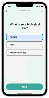
Onboarding asks for sensitive health information such as biological sex, weight, chronic conditions. Showing all of these on one long form would feel invasive and overwhelming. Breaking them into individual screens with clear progress ("Question 1 of 6") makes each disclosure feel manageable.
_%20Sex%20selection%20(1)-portrait.png)
_%20Age-portrait.png)
-portrait.png)
Progressive disclosure on the daily flow
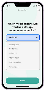
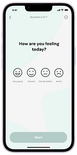
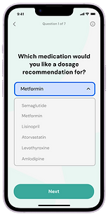
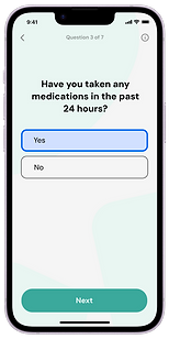
The daily check-in adapts based on your answers. If you say you've taken medications in the last 24 hours, a follow-up screen appears asking which ones. If you say no, it skips ahead. The form only asks what's relevant.
_%20Med%20Selection-portrait.png)
_%20Mood%20input-portrait.png)
The result screen communicates range, not certainty
The dosage result shows "1.5 – 2.0mg" on a gauge with Low and High ranges visible. A range with context builds appropriate trust. The safety messaging reinforces that this is a tool, not a prescription.

THE FULL PRODUCT
Complete user journey
The final product spans 40+ screens across 5 core sections.
_%20Med%20Selection-portrait.png)
_%2024hours%20input-portrait.png)


History
Users can review past dosage recommendations and the inputs that generated them. Each record is editable, so users can correct mistakes without re-entering everything.
Profile & Settings
Health information is editable after onboarding. The extended profile includes data deletion and privacy policy access which is important for a medical product handling sensitive personal data.

Connect to Patch
A future-state screen for Aptamer's microneedle patch hardware integration. Designed as a placeholder so the app structure accommodates future hardware without requiring a redesign of core flows.

OUTCOME
What I delivered
A functional MVP, implemented by the development team and used for investor validation
40+ screens across 5 core sections: Onboarding, Daily Dosage, History, Profile, and Connect
Complete developer-ready handoff assets in Figma
Product direction and scope decisions that shaped what the MVP included and excluded
REFLECTION
What I'd do differently
The daily dosage flow adapts based on user answers. If you've taken medications recently, a follow-up screen appears; if not, it skips ahead. But nothing in the UI tells the user the form is adapting. They can't see what the AI is factoring into their recommendation.
If I had more time, I would have added a summary review screen before the calculation which would show the user exactly what inputs the AI is weighing. In a medical context, transparency isn't just good UX, it's a trust requirement. Users need to see why they got a specific dosage, not just what it is.
I'd also carry the "Why we ask this" tooltip pattern from onboarding into the daily dosage flow. Questions about recent medications and symptoms are just as sensitive as the onboarding questions, but the daily flow doesn't explain the reasoning behind them. Consistency in that trust-building pattern matters, and I missed it under the timeline pressure.
This project taught me that in healthcare products, every design decision is really a trust decision. That's the lens I want to bring to my next role whether the domain is health, finance, or anything else where users are making high-stakes decisions based on what the interface tells them.