DESIGN CHALLENGE · PRODUCT DESIGN
Security Vendor Discovery
Designing a vendor evaluation tool for enterprise CISOs who need to make defensible buying decisions, not just good ones.
ROLE
Design Challenge
TIMELINE
5 Hours · July 2026
COMPANY
SACR Exodus
TOOLS
Figma · Claude Design · Figma AI
OVERVIEW
About this project
SACR is an independent cybersecurity research firm that helps security leaders evaluate vendors and reach well-supported buying decisions. They sent me a design brief as part of their product team interview process and gave me 5 hours to work with it.
The brief was intentionally open. I got a user, some organizational context, and a core problem. The rest was up to me.
ROLE
Solo Designer
COMPANY
Software Analyst Cyber Research (SACR)
TIMELINE
Enterprise B2B · Security Research · CISO Workflow · AI-Assisted
WHAT I OWNED
Product direction, UX strategy, all UI design, evidence system architecture, mobile considerations
THE PROBLEM
The challenge with vendor evaluation
The brief introduced me to Dana Osei, a CISO at a large enterprise. Dana has a lean security team, runs a multi-cloud environment, and is trying to consolidate tools without making a mistake that comes back to haunt her.
Evaluating security vendors is a big part of her job.
The problem is not finding capable products. There are plenty. The problem is reaching a decision she can actually defend to security, finance, procurement, risk, and executive stakeholders. All of whom will ask different questions and trust different things.
PRODUCT DIRECTION
The pivot that shaped everything
There was one line in the brief that I kept coming back to. Dana does not just need to reach a decision. She needs to be able to defend it.
Dana does not need to make a decision. She needs to defend one.
That reframed the whole product problem for me. A tool that helps her pick the best vendor on paper is not the same as a tool that helps her stand in a room full of skeptical stakeholders and explain her reasoning. Every design choice I made came back to that distinction.
CORE DESIGN DECISION #1
Filtering for fit, not ranking by reputation
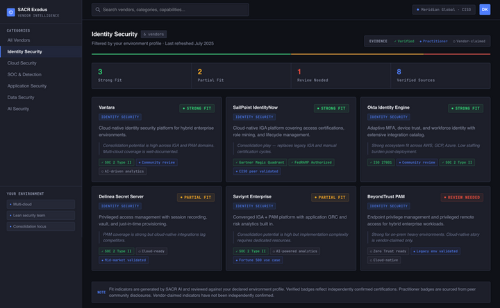
The brief mentioned that Dana does not trust universal vendor rankings. So I did not build one.
Instead, the dashboard organizes vendors by security category and filters the view against Dana's own environment. Multi-cloud. Lean team. Consolidation focus. Each card shows a fit label, not a score: Strong Fit, Partial Fit, or Review Needed, with one line of context tied to her specific situation.
A score collapses the moment someone asks where it came from. A label with a reason does not. Dana can say it out loud and it holds up. There is also a summary bar at the top. Three strong fits, two partial, one review needed in Identity Security. That is the number she walks into the room with before she has opened a single vendor card.
CORE DESIGN DECISION #2
Designing for trust in a high-stakes context
The vendor profile is where I spent most of my thinking time. The main decision was splitting evidence into three separate sections so Dana always knows what kind of information she is looking at before she decides how much weight to give it.
Tier 1
Verified Facts
Independently confirmed information. Certifications, integrations, compliance standards. Things that can be checked and cited in a procurement meeting.
Tier 2
Practitioner Experience
Real quotes from security professionals attributed by role. I included one positive, one mixed, and one cautionary response about pricing because that is what honest feedback looks like. A page of praise would not be trustworthy and Dana would know it.
Tier 3
Vendor Claims
Self-reported information, clearly labeled as such with a note to treat it as directional. Not hidden. Just clearly marked so Dana knows what she is reading before she draws any conclusions.
That separation is the whole point of the product. Dana can look at any piece of information and immediately know how much weight to give it. Which means she can explain it to someone else.
CORE DESIGN DECISION #3
Organizational fit without a score
At the bottom of the vendor profile I added an organizational fit section. Instead of giving Dana a score, I gave her a two-column breakdown: where this vendor works for her environment on the left, where it creates friction on the right.
Every point maps to something real in her context: multi-cloud coverage, staffing burden, consolidation potential. She can walk through it column by column with her team and explain exactly why she is leaning one way. No number to defend, just structured reasoning.
TRADE-OFFS
What I cut
I left out side-by-side vendor comparison, saved lists, favorites, onboarding, and full mobile screens. The brief said doing one thing well beats doing five things halfway and I believed it.
Comparison would be the first thing I built with more time. It is the natural next screen after the profile and it completes the evaluation journey.
For mobile I wrote a description rather than designing screens: sidebar collapses to a bottom tab bar, vendor cards stack to one column, fit labels move to the top of each card so Strong Fit and Review Needed are visible without scrolling.
TRADE-OFFS
How I used AI in the design process
I used Figma AI and Claude Design to generate the visual output within the time budget. The frames are image-based rather than fully layered components, which was a deliberate trade-off.
I wanted to spend the 5 hours on the thinking and structure, not on manual build-out. The reasoning behind the design is the actual work. The screens are how I communicated it.
OUTCOME
What I delivered

A vendor dashboard filtered by organizational context using fit labels instead of rankings
A three-tier evidence system separating verified facts, practitioner experience, and vendor claims
A two-column organizational fit breakdown tied to Dana's specific environment
A Loom walkthrough focused on design thinking, not just screen layout
REFLECTION
What I'd do differently
The first thing I would test is whether the three-tier labeling system actually matches how CISOs think about evidence in practice. The category names made sense to me but I want to hear from someone who does this job whether they land the same way for them.
I would also run the organizational fit section past a real security practitioner. The two-column format felt more useful than a score but that assumption needs validation before I would call it a final design direction.
And I would build the comparison screen. That is where the experience actually finishes and right now it stops one step short.